Håndværksrådet
Crossroads|
client: Håndværksrådet
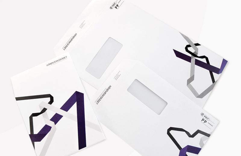
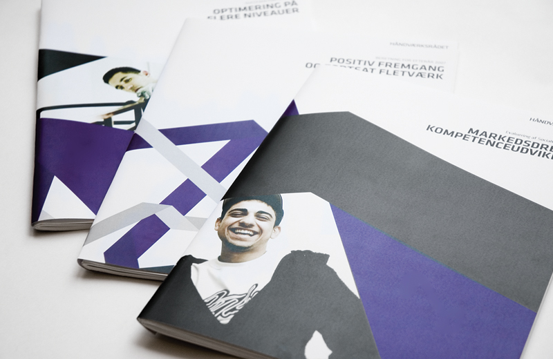
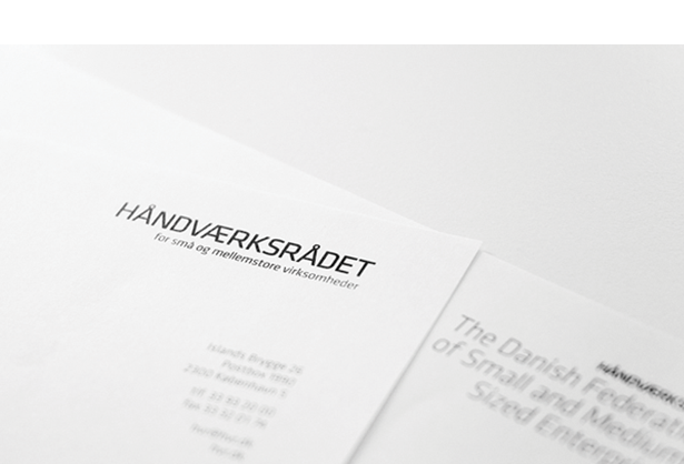
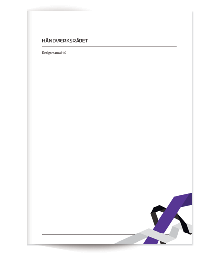
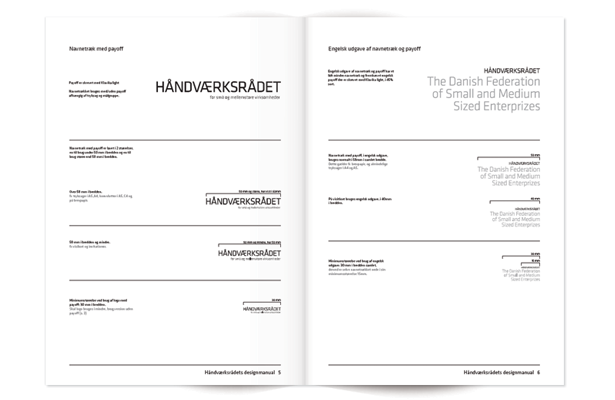
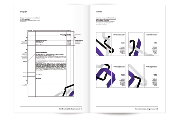
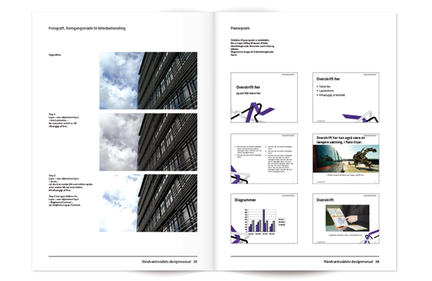
Håndværksrådet / The Danish Federation of Small and Medium Sized Enterprises has broadened their base of members throughout the last ten years, as a result of this, their previous symbol, the hammer, had been outdated for a while. The approach of the concept of the new identity was made in order to portray not the members of the federation, but the work made by the federation, IE. a modern federation, networking, lobbying, connecting the dots between their member groups and their political counterparts. The new visual identity consists of a custom logotype and an abstract visualization of wickerwork. By interacting and sharing knowledge and resources with their members Håndværksrådet will become an even greater supporter of the small and medium sized enterprises in Denmark. The identity for Håndværksrådet is a complete visual language that can be changed and scaled across different media platforms without loosing its uniqueness. The identity changes it shape and scale on everything from stationary and publications to web and screen savers. This gives the impression of a modern company with the abilities and willingness to adapt to the ever changing markets and political situations of their growing group of members. In order to manifest the uniformity of the wickerwork there was made a design manual with patterns to pick from, and guides on how to change these, and/or make entirely new ones with the same unique look. made at Goodmorning Technology |
|
|
|

|
|
|
|
|
|
|