Belkin
People Inspired Products|
BRAND NEW AWARD 2011
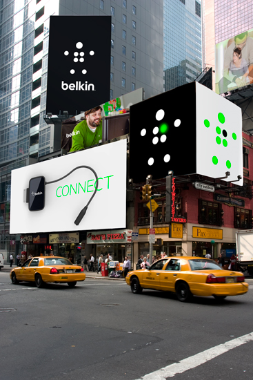
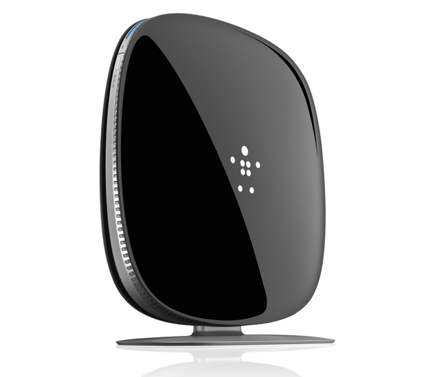
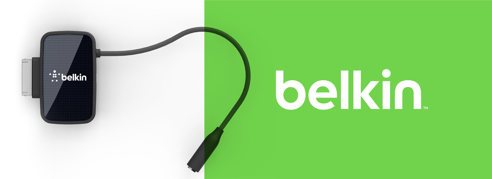
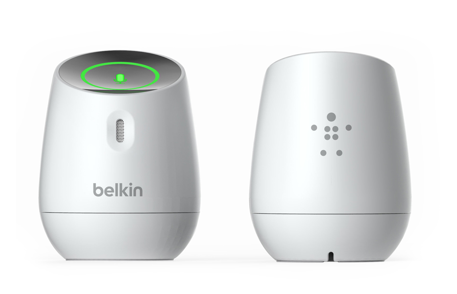
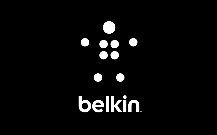
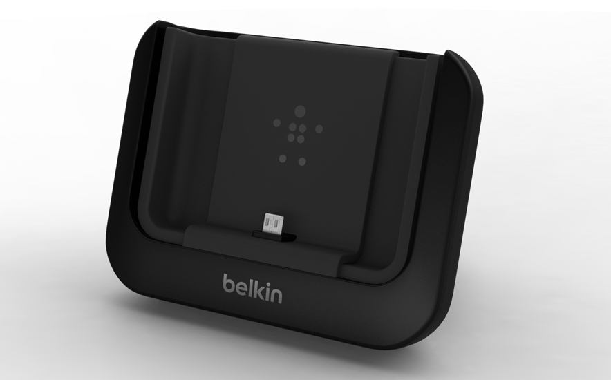
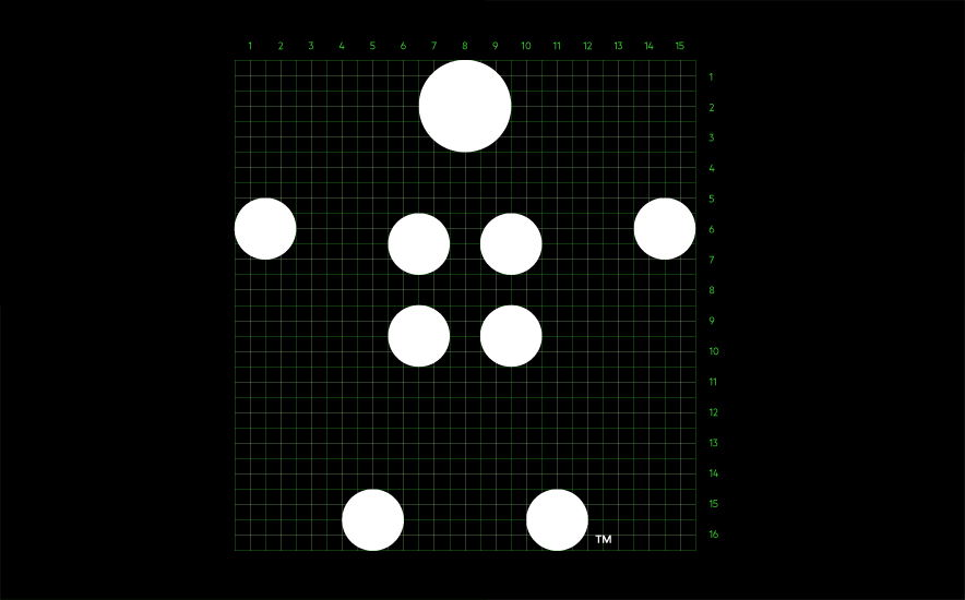
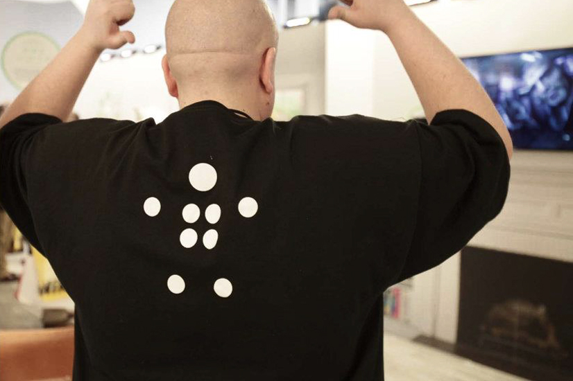
Honorary Mention, Identity. We redesigned this brand identity working closely with Belkin. The new symbol, PiP, and logotype is designed to reflect Belkins position. “The new Belkin logo, affectionately named PIP for People Inspired Products, symbolizes our commitment to take inspiration from people, and acknowledges the connection between people and the experiences they value most.” Ernesto Quinteros, Belkin’s Chief Brand Officer. The mark, PiP, makes the user work just a tiny little bit to connect the dots just like Belkin works to close the gaps between the product that you love and the technology that surrounds us. The mark is designed to work on products alone giving it iconic power as well as with the logotype. The "heart" of PiP can be activated on products to show on/off functions etc. Made as part of the design team at Wolff Olins with Jordan Crane, Todd Simmons, Christian Butte, LA Hall & Eric Wrenn. Strategy by Mary Ellen Muckerman. |
|
|
|
|
|
|
|
|

|

|

|

|

|
|
|
|

|
|