Anonymous
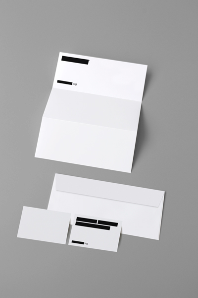
Anonymous Branding|
As an exercise in the visual language I asked my self "What if Anonymous went corporate!?" With the group being more and more in the media they could need to button up and streamline their appearance to appear more professional whilst unifying the brand experience.
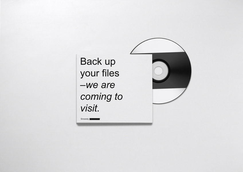
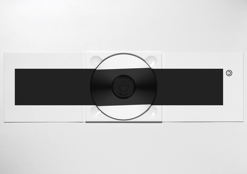
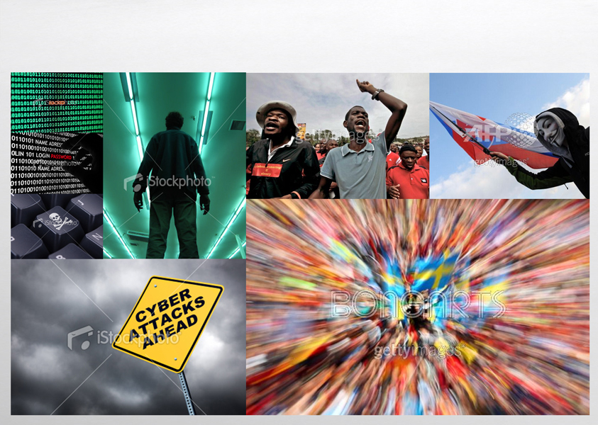
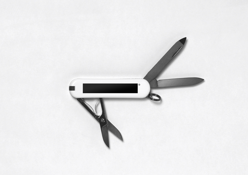
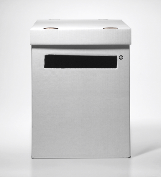
The logotype/mark is anti-authoritative and obviously completely illegible to stick with the roots of the anarchistic group. Colors are used minimally for optimal effect and focus on content and logo. The secondary typeface being Arial as a default online typeface – combining ease of use with rebelling against its more popular "cousin" Helvetica. Tone of voice is polite yet in your face as seen on the greeting card (CD). This strapless sweetheart empire dress becomes prettier because of the application of one shoulder strap. Little ruffle accent is installed on this one shoulder strap. Another plus size wedding dresses come in rustic and romantic style. This chic halter ball gown dress looks elegant with backless cut. It may be the most beautiful wedding dresses for you. However, this halter backless dress offers a nice tone combination of blush pink and ivory. That’s why we call it as a romantic rustic dress for bridal. Anyway, two other pictures display inspirational plus size wedding dresses models for you. Photography is based on action focused images combined with iconic/cliche images with hackers/hacking statements etc. Photos should celebrate rebellion and power of the people – iwith the spirit of the organisation in mind all photos have of course not been cleared and/or payed for, making any online image library available to Anonymous. This project is neither for or against the actions by Anonymous, but simply exploring and playing with the power of visual identity. |
|
|
|
|
|
|
|